E-Commerce·Jonah Reed·
E-Commerce in 2026: Store Setup Mistakes That Cost Sales

Most stores do not have a traffic problem. They have a setup problem that becomes visible only after someone tries to buy.
Key facts
- Most stores have a leak problem, not a traffic problem
- Shipping cost and delivery date belong on the product page
- Variants and stock status should be obvious at a glance
- Guest checkout removes a real reason to leave
A store can look finished and still lose most of its visitors. The product page loads, the images are sharp and the brand feels right, but the shipping cost appears only at checkout, the size guide is missing and the discount code fails on a mobile phone.
These are setup mistakes, not marketing problems. They are cheap to fix and they compound: every visitor who leaves at the same step is a signal about where the store is failing.
Put the cost and the date up front
Shipping cost and delivery time belong on the product page, not in a surprise at checkout. A visitor who sees a total early can decide whether to buy. A visitor who sees it late feels tricked and leaves, often for good.
State the returns window in the same place. If returns are free, say so; if the customer pays postage, say that too. Clear terms reduce support messages and increase the number of people who complete an order with confidence.
Make variants and stock obvious
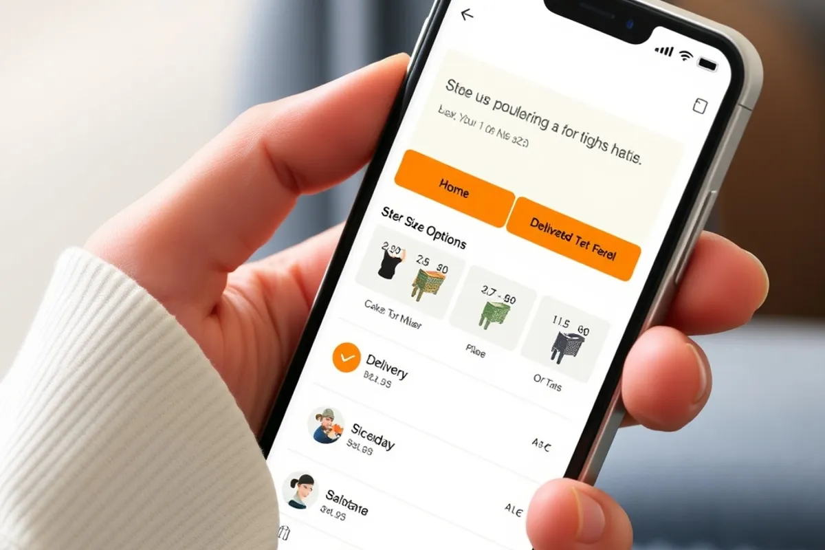
Variants are where small catalogues get confusing. If a product comes in three sizes and two colours, show the combination clearly and disable options that are out of stock. A dropdown that hides the unavailable choice wastes a click and invites an error.
Stock status should be honest. A vague in stock label on a product that ships in three weeks creates a refund request later. If the item is a pre-order, say pre-order and give the date.
Conversion is not persuasion. It is the removal of reasons to leave.
Fix the checkout before buying ads
Checkout is where intent is highest and friction is most expensive. Show the total before payment, offer the payment methods people use in your market, and let guests buy without creating an account. Every required field that is not strictly necessary is a small tax on completion.
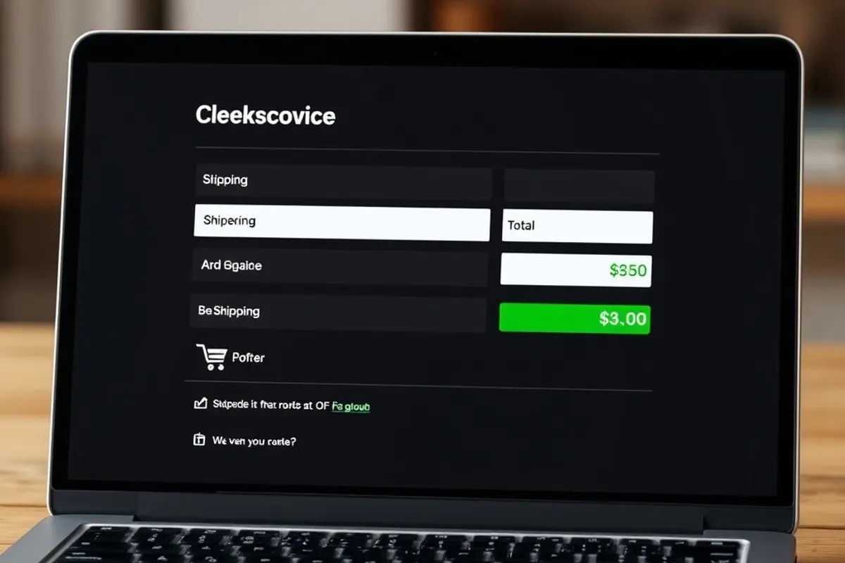
Test the whole flow on a mid-range phone over a slow connection. A store that takes six seconds to become usable loses people before they see the price. Compress images, lazy-load below the fold and remove third-party scripts that do not earn their weight.
The setup checklist
- Shipping cost and delivery date are visible on the product page.
- Variant options show availability and disable impossible combinations.
- Guest checkout works and the total is shown before payment.
- The returns policy is one click from every product.
- The flow is tested on a mid-range phone over a slow connection.
Measure the leak, then fix one thing
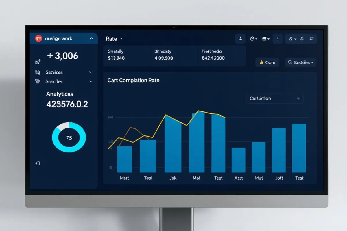
Track arrival, product view, add to cart and completed order. The biggest drop is the leak worth fixing first. Change one thing, measure a full week and compare. If you change five things at once, you learn nothing and you cannot tell which change deserves to stay.
For the photos that carry the product page, read our budget photography guide. For the site around the store, see our Web Design section.
Written by Jonah Reed for Rhetts Cheuvront. Tips or corrections? Contact the desk.